
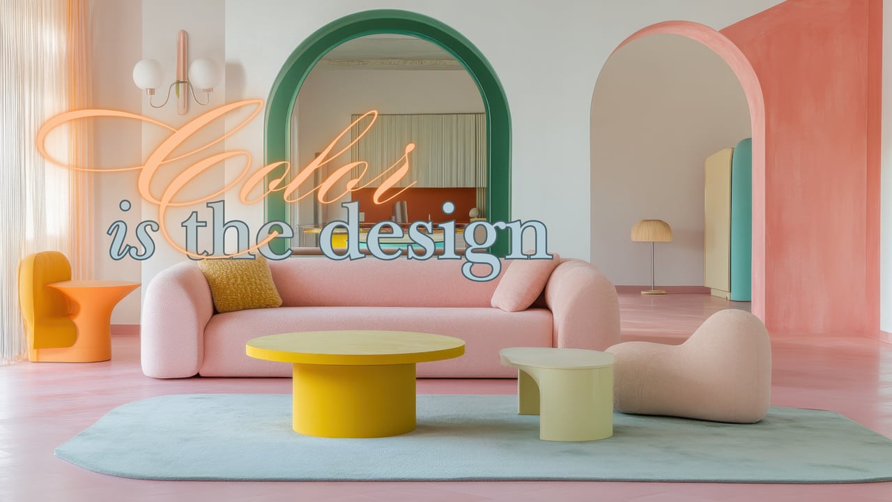
Look at this room.
Before you notice the arches or the furniture, you feel something.
That feeling is color.
Color is not an accessory. It is mood. It is energy. It quietly tells your nervous system how to respond to a space. In this room alone you see soft blush, coral, green, yellow, and pale mint. None of them compete. They work together. That is why the room feels thoughtful instead of busy.
Warm tones — coral, peach, soft pink — feel welcoming. They invite conversation. They soften the edges of a space. Greens steady us. They feel grounded. There is a reason we relax when we are near nature. Yellow brings light and optimism. Used well, it lifts a room without overpowering it.
When colors are layered like this, the space feels alive. Your eye moves. The room has depth.
Now compare that to a house painted entirely grey.
Neutral can be beautiful. But when everything is muted — walls, floors, cabinets, furniture — something changes. The room can feel flat. Quiet in a way that does not always feel calm. Sometimes it feels disconnected.
Color affects mood more than most people realize. Restaurants understand it. Hotels use it carefully. It influences how long you stay in a room and how comfortable you feel.
Homes are no different.
I have shown properties that were fully updated but painted entirely grey. Buyers respected them. They just did not connect to them.
Then I have shown modest homes with thoughtful color — a deep dining room, a warm hallway, a bold powder bath — and suddenly the house felt memorable.
Color gives a home personality.
It also creates balance. A soft rug beneath a brighter table. A contrasting arch that frames a view. A warm accent against a cooler wall. Those shifts create rhythm.
Grey became popular because it felt safe. But safe is not always inspiring.
When color is chosen with intention, it carries the room. It shapes emotion. It makes a home feel collected rather than assembled.
And when buyers walk into a home that makes them feel something — calm, energized, grounded — they linger.